Nokia Pure
Wednesday, May 23rd, 2012
Dalton Maag’s type family Nokia Pure recently won the Graphics category of one of the most prestigious awards in design, the Design Museum ‘Designs of the Year 2012’. These awards showcase the most innovative and progressive designs from around the world, spanning seven categories: Architecture, Digital, Fashion, Furniture, Graphics, Product and Transport. It is very rare to see a font acknowledged at such a prestigious award.
Dalton Maag was asked by Nokia to design a typeface primarily for use in digital media (mobile devices and the web), which would also be versatile enough to be the cornerstone for all of Nokia’s communications worldwide. In their own words, the new font family had to reflect the traditions of Finnish design: simplicity, clarity, functionality and beauty of form – in short, Pure. The clean lines of the letter forms make this a font that is easy to read with no unnecessary frills to distract from its message. As Dalton Maag have added script systems to the font, they have carried through the essential character of the font and kept the ethos that this is a font about legibility and purity of design.
Nokia Pure is a very special typeface because of its impressive reach. It currently supports 15 different script systems, covering the languages of about 4 billion people around the world. Work continues on the project, with Tamil and Khmer being the latest scripts systems to be completed.
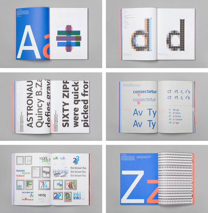
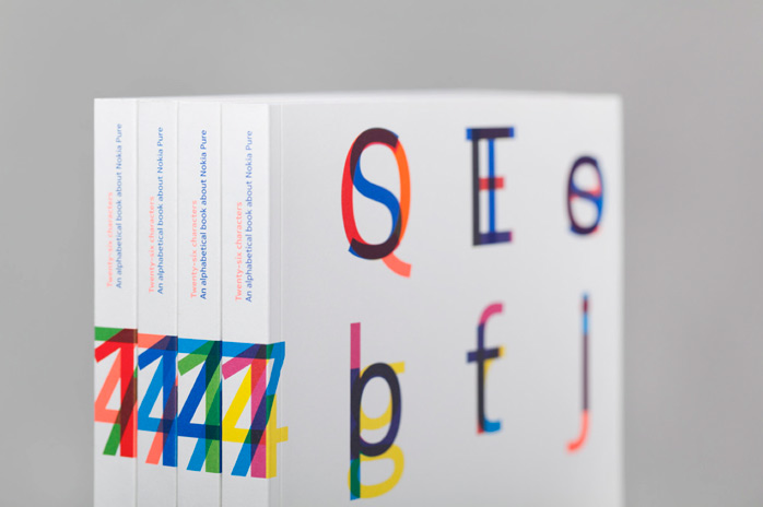
 Published by Gestalten, Twenty-six characters, An alphabetical book about Nokia Pure is an exploration of Nokia’s new typeface, designed by typography icon Bruno Maag, offering inspiration and insight for establishing an indispensable visual language.

Not commented yet.